Product
Check it by MAS redesign
Check it by MAS redesign
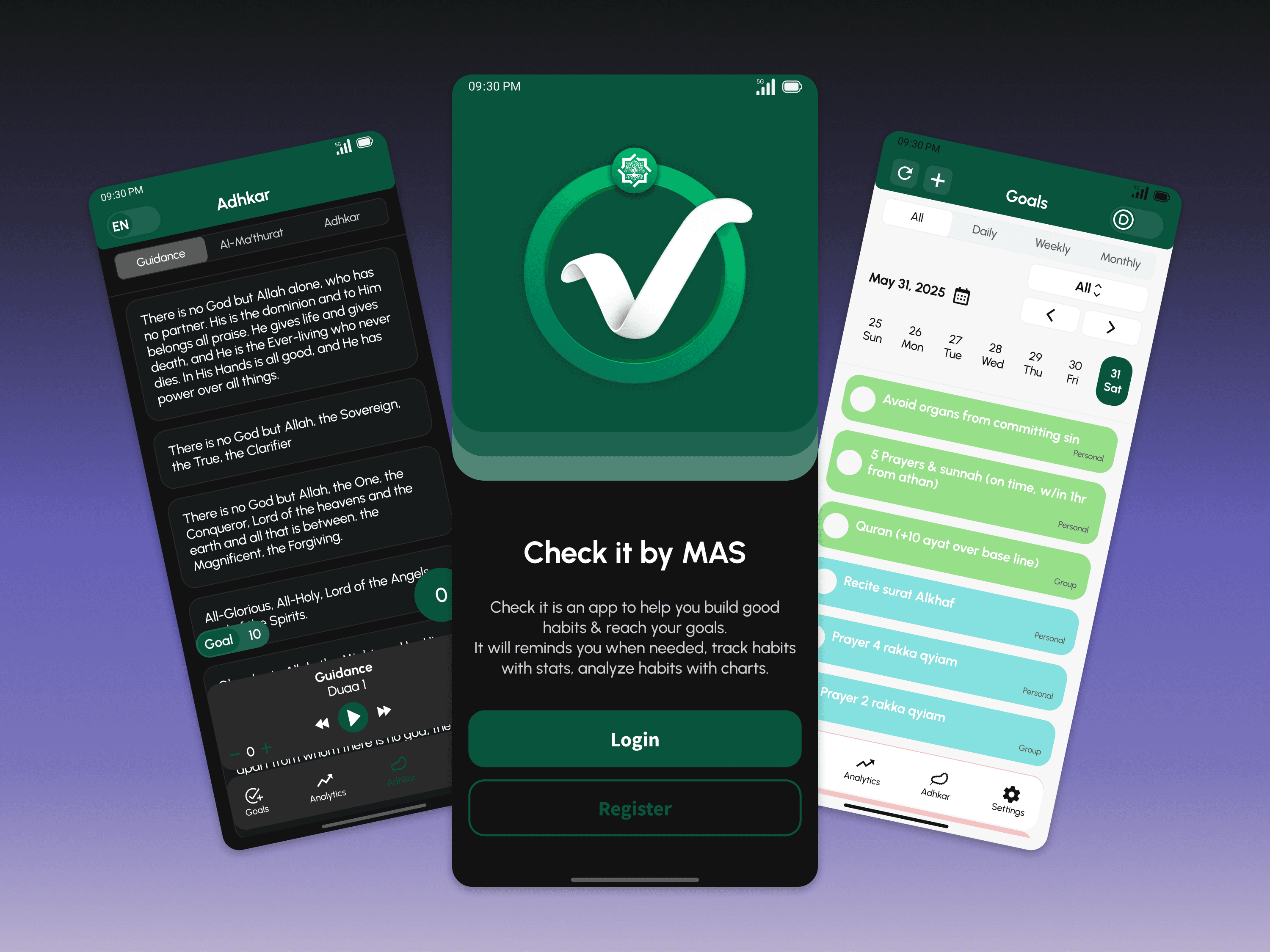
Redesigned Check it by MAS app and logo for a modern, intuitive experience, light/dark modes, enhanced features and vibrant detail-focused branding.
Redesigned Check it by MAS app and logo for a modern, intuitive experience, light/dark modes, enhanced features and vibrant detail-focused branding.
Client:
Client:
MAS
MAS
Role:
Role:
Product Designer
Product Designer
Year:
Year:
2025
2025
The Challenge
CheckIt was already a functional habit and goal tracking app, but the experience felt visually outdated and inconsistent. Controls were not always clear, the design lacked a unified system, and areas such as authentication, settings, notifications, and Adhkar needed a more intuitive experience. The existing identity also made the product feel unfinished rather than like a polished app users could trust and return to regularly.
The Direction
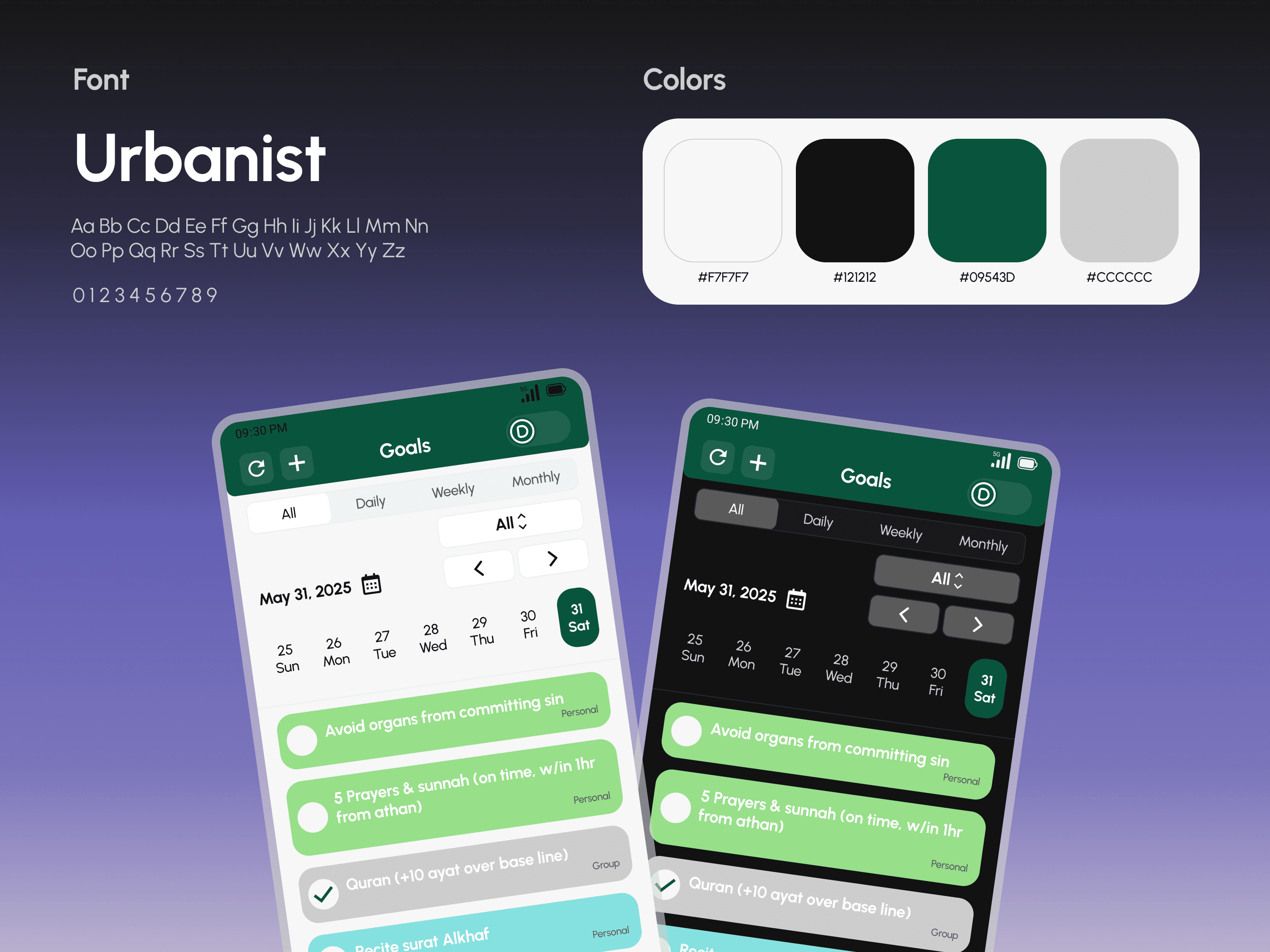
I focused on preserving the core functionality that already worked while making the entire experience clearer, more consistent, and more enjoyable to use. The redesign introduced a stronger visual identity, clearer hierarchy and controls, improved supporting flows, and a unified system across light and dark modes, while keeping the product centered around helping users build and maintain meaningful habits.
Key Design Decisions
1. Make goals easier to scan
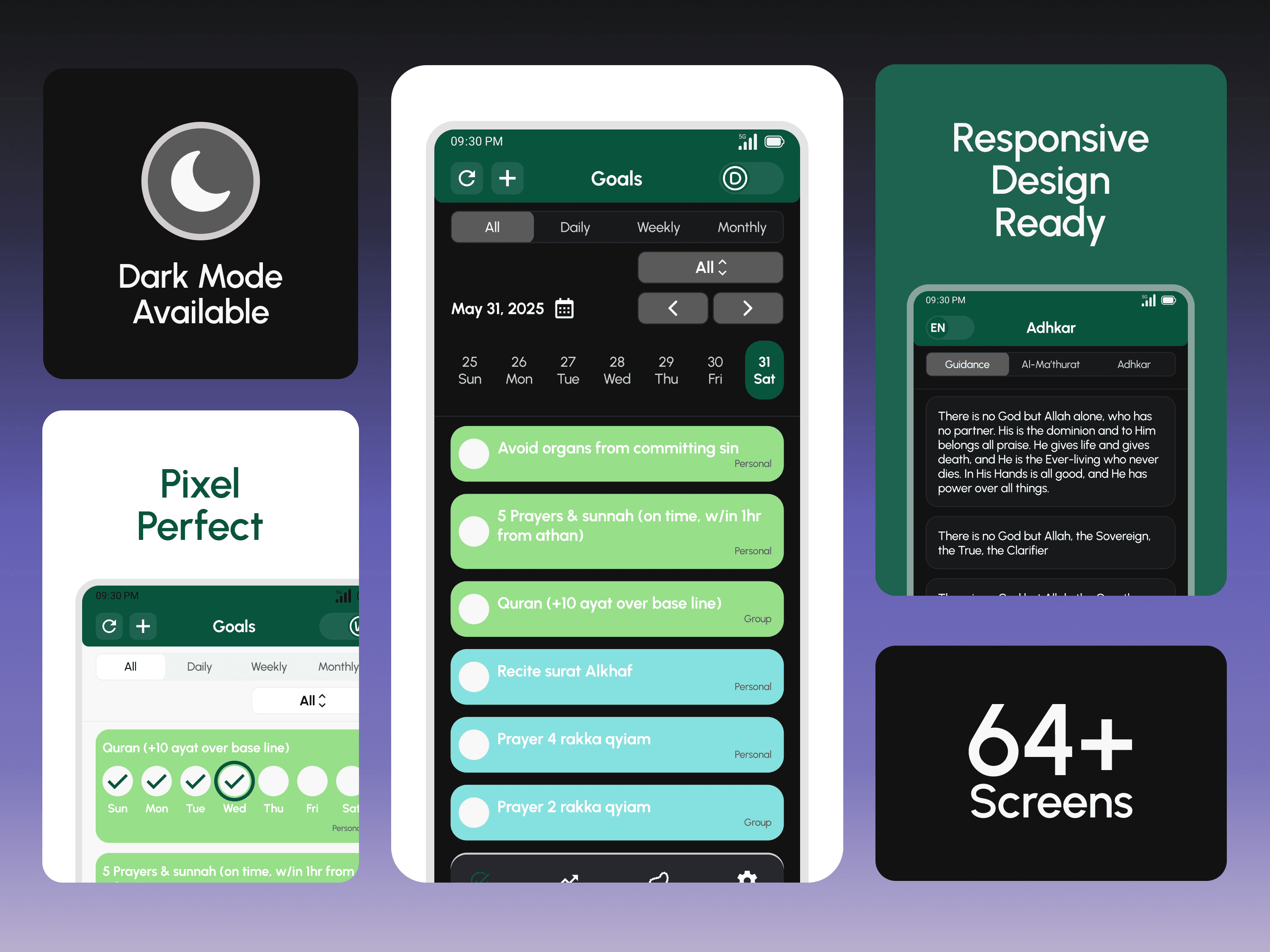
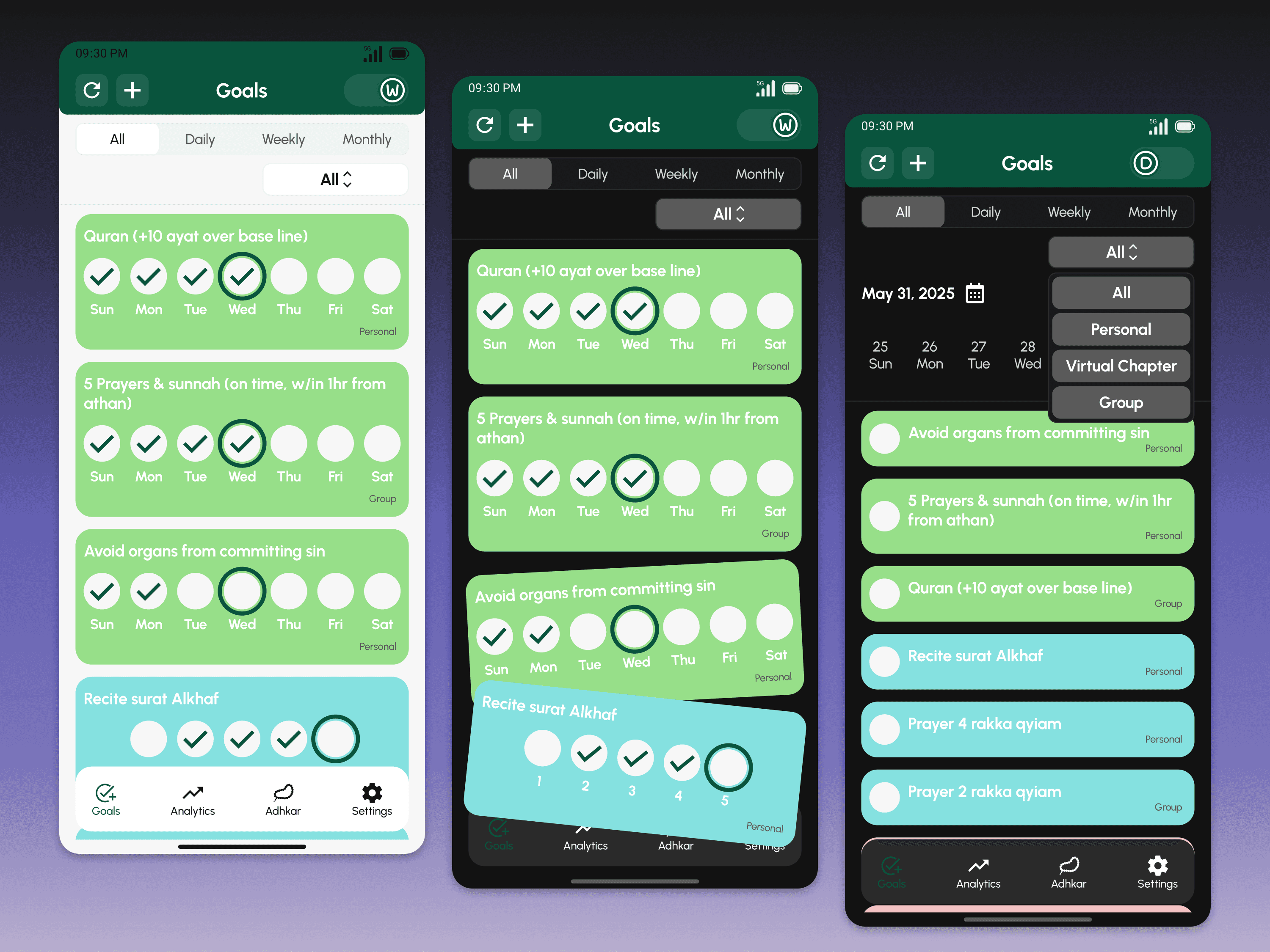
Improved the hierarchy, filtering, controls, and color coding of daily, weekly, and monthly goals so users can understand their activity and available actions more quickly.
2. Clarify controls and supporting flows
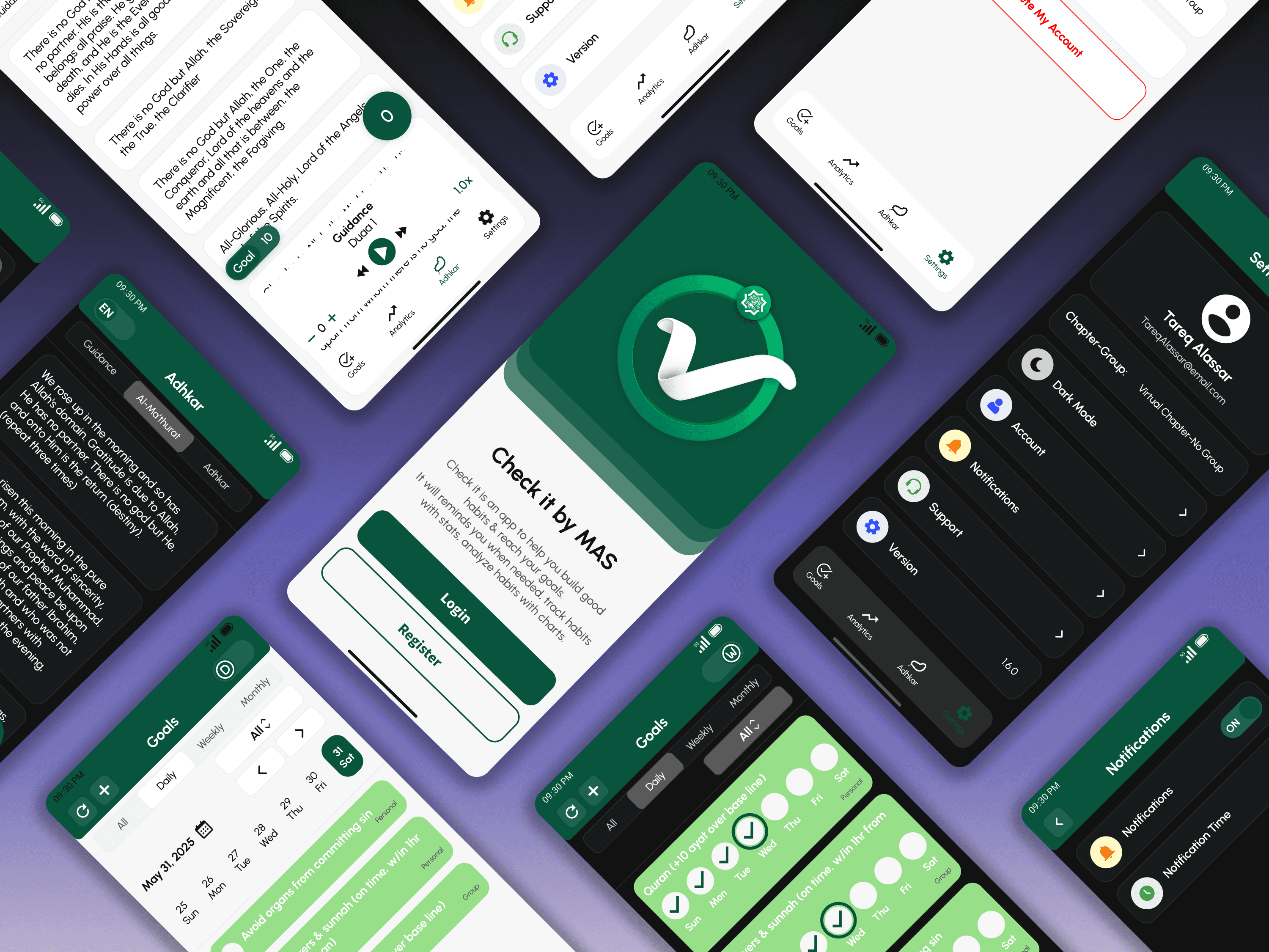
Refined interactions throughout the app and expanded areas such as authentication and settings with social login, notification controls, theme selection, support, and clearer account actions.
3. Refine the Adhkar experience
Redesigned the existing language, reading, repetition, and audio controls to make them easier to understand and use, with stronger typography, clearer hierarchy, and more visible playback states.
4. Build a stronger product identity
Refined the existing green identity into a modern visual system and redesigned the logo, carrying the new direction across the interface and into an animated splash screen.
The Solution
I handled the complete UI and UX redesign, covering more than 64 screens across light and dark modes. I redesigned the visual identity, logo, typography, authentication, Goals, Adhkar, settings, supporting flows, and responsive mobile behavior, while bringing the existing Analytics experience into the new visual system.
The product was built in Figma using reusable components, color styles, auto layout, and clearly defined interaction states for elements such as completed goals, filters, menus, toggles, playback controls, and settings. The entire experience was also fully prototyped, including transitions, menus, state changes, and micro interactions, creating a detailed reference for developer handoff.
The Outcome
The redesign transformed CheckIt from an inconsistent and dated experience into a more cohesive, intuitive, and premium product with a stronger visual identity and clearer interactions. The complete redesign and prototype were approved and handed off to the client and ready for implementation.
Ready To Build Yours?
Ready To Build Yours?
Start with the package that matches your next move, then we’ll shape the scope around what your project actually needs.
Start with the package that matches your next move, then we’ll shape the scope around what your project actually needs.
Web/Mobile Apps & product UI
Product interfaces designed from structure to polished handoff with clear flows, sharp screens, and systems ready for build.
$2,000
+
Custom pricing
Strategy
Product structure
User flows
Wireframes
Interface
Core screens
Visual direction
Interactive prototype
Delivery
Figma file & assets
Feedback cycles
Developer handoff
Best for MVPs, SaaS tools, dashboards, and internal platforms that need clarity before development.
Web/Mobile Apps & product UI
$2,000
+
Custom pricing
Product interfaces designed from structure to polished handoff with clear flows, sharp screens, and systems ready for build.
Strategy
Product structure
User flows
Wireframes
Interface
Core screens
Visual direction
Interactive prototype
Delivery
Figma file & assets
Feedback cycles
Developer handoff
Best for MVPs, SaaS tools, dashboards, and internal platforms that need clarity before development.